
Process
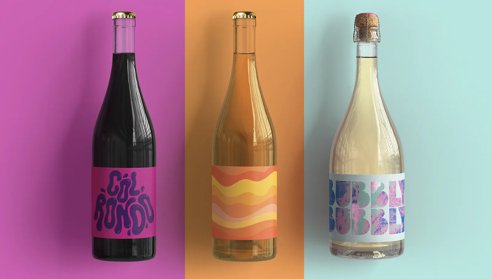
Their goal was to reflect the rugged Welsh landscape and the vineyard’s experimental spirit.
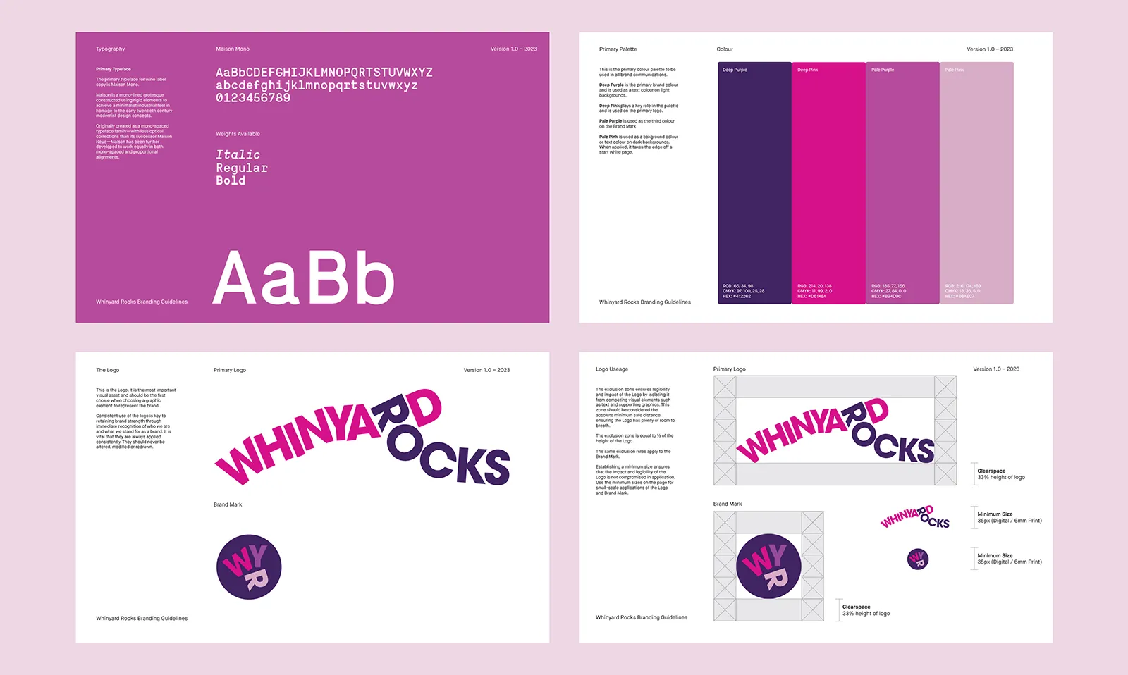
We used deliberately ‘wonky’ typesetting in the logotype to echo the wild, unpredictable character of the terrain — capturing the essence of the brand in a playful but purposeful way.
The label designs were bold and intentionally unconventional, created to reflect the punchy fruit-forward flavours of the wines and to stand apart from more traditional bottles on the shelf.
Services
Brand Identity
Packaging Design
Design & Illustration


All Works